By Tim Singer
Color does more than decorate—it defines the feeling of a space. In Fort Lauderdale’s luxury homes, where natural light, ocean views, and open design are key, paint colors can completely transform your home’s mood and energy. I’ve seen firsthand how the right tones enhance architecture, highlight waterfront vistas, and create harmony throughout a home. Let’s explore how to choose the perfect color palette for every room, blending design psychology with our signature coastal lifestyle.
Key Takeaways
- Use color psychology to shape mood and atmosphere in each room.
- Consider Fort Lauderdale’s coastal light when selecting tones.
- Luxury homes benefit from subtle, layered neutrals and texture contrasts.
- Test colors in natural light before committing to full-scale painting.
Understanding the Science Behind Color
Choosing the right paint color isn’t just about preference—it’s rooted in psychology and perception. Color affects how we feel, how we experience space, and even how we connect to a home.
Why Color Matters in Luxury Design
- Emotional Influence: Warm hues like soft beige or blush evoke comfort, while cool tones like seafoam or gray promote calm.
- Spatial Perception: Lighter colors expand smaller spaces, while deep tones add intimacy and depth.
- Architectural Enhancement: Strategic color choices draw attention to architectural features, high ceilings, or natural textures like wood and stone.
- Lifestyle Fit: Colors should align with how you live—serene spaces for relaxation, bold accents for entertaining.
The Role of Natural Light in Fort Lauderdale Homes
In South Florida, sunlight is both abundant and dynamic. Fort Lauderdale’s intense natural light changes color perception throughout the day, especially in waterfront and high-rise homes.
How to Choose Colors That Work With the Light
- Morning Light: East-facing rooms benefit from soft whites and warm neutrals that glow under golden light.
- Afternoon Light: West-facing spaces handle cooler shades like pale blue or soft gray to balance brightness.
- Consistent Light: North-facing rooms with steady illumination can support deeper colors like charcoal, navy, or taupe.
- Reflection Factor: Water views and marble floors reflect light differently—test swatches near these surfaces to ensure balance.
Creating a Luxury Color Palette
Luxury homes in Fort Lauderdale often feature open layouts, so colors must flow seamlessly from one space to another. A unified palette keeps the home elegant, cohesive, and timeless.
Steps to Build a Sophisticated Palette
- Start With a Foundation: Use a base of warm white, creamy ivory, or sandy beige to complement coastal architecture.
- Layer With Neutrals: Add dimension through subtle contrasts—think mushroom, linen, or greige.
- Incorporate Texture: Venetian plaster, matte finishes, or grasscloth wallpapers add luxury without overwhelming color.
- Add Accents: Metallic finishes, navy trims, or soft aqua ceilings offer personality while maintaining harmony.
Choosing Colors Room by Room
Each room has its own purpose, so each deserves a tone that enhances its function. Fort Lauderdale’s architecture—with its wide windows and fluid indoor-outdoor flow—invites colors that connect to nature.
Living and Dining Areas
- Why It Matters: These are the social hubs of luxury homes, where color sets the tone for entertaining.
- Top Choices: Warm neutrals, pale gold, or champagne hues create sophistication while reflecting sunlight beautifully.
Kitchens
- Why It Matters: The kitchen is both a gathering and design focal point.
- Top Choices: Crisp white cabinetry with soft gray or blue-green walls pairs well with marble countertops and coastal finishes.
Bedrooms
- Why It Matters: Bedrooms should feel peaceful and restorative.
- Top Choices: Muted seafoam, dove gray, or taupe provide a restful balance, especially when paired with natural linens and wood tones.
Bathrooms
- Why It Matters: Color can transform small spaces into spa-like retreats.
- Top Choices: Pale aqua, ivory, or even soft blush tones reflect the serenity of the ocean and sky.
Outdoor Living Areas
- Why It Matters: Exterior spaces are central to Fort Lauderdale living.
- Top Choices: Use crisp whites or sand tones that resist fading, and accent with deep blues or corals that reflect the coastal palette.
How Color Enhances Architectural Style
Fort Lauderdale’s luxury homes range from sleek modern builds to Mediterranean estates. Each architectural type calls for a distinct color approach.
Matching Color to Style
- Modern Coastal: Minimalist palettes with bright whites, cool grays, and subtle blues highlight clean lines and glass architecture.
- Mediterranean Revival: Warm terracotta, olive, and cream enhance arches and textured stucco.
- Contemporary Waterfront: Neutrals with bold accents—charcoal, teal, or bronze—echo water reflections and sunset tones.
- Tropical Modern: Muted greens, sand, and driftwood-inspired hues tie the indoors to lush outdoor landscaping.
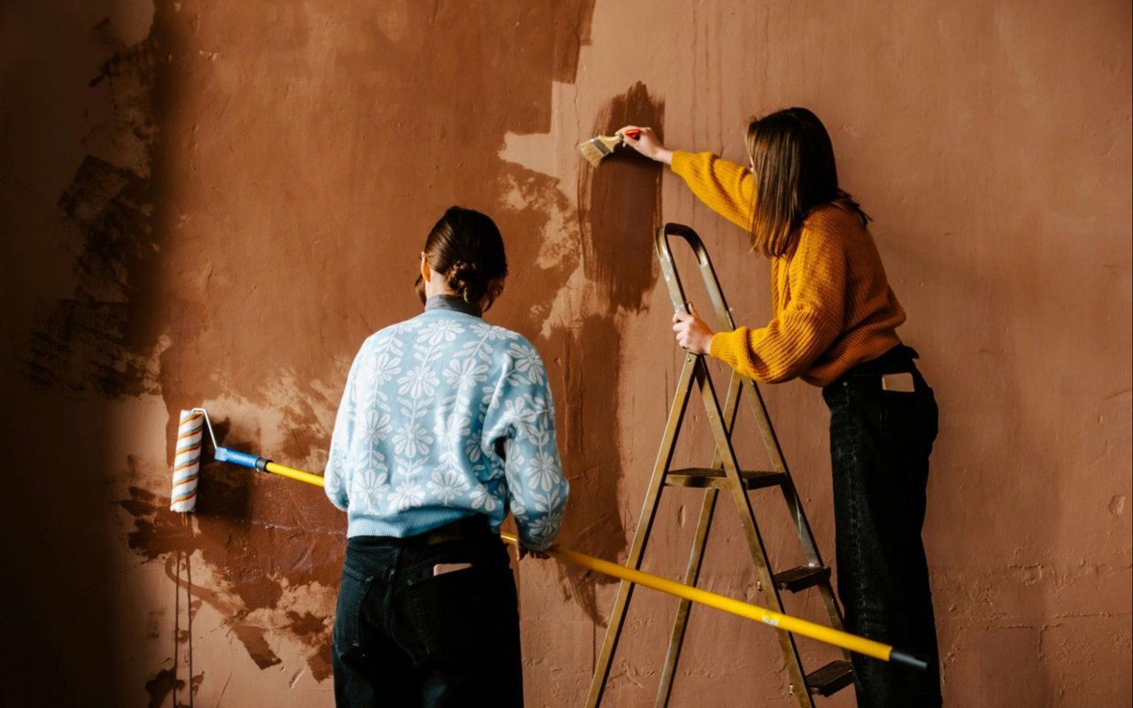
Testing and Perfecting Your Palette
Before finalizing your colors, always test in real light conditions. What looks perfect in a paint store can shift dramatically under Fort Lauderdale’s sunlight.
Best Practices for Testing Colors
- Sample Strategically: Paint large swatches on multiple walls to see how the tone reacts to light at different times of day.
- Compare Finishes: Matte, satin, and gloss finishes all reflect light differently—choose based on texture and room function.
- Evaluate Flow: Stand in transition areas to make sure colors complement each other between open rooms.
- Work With Professionals: A color consultant or designer can help refine your palette for maximum sophistication and resale value.
FAQs
What are the best neutral colors for Fort Lauderdale luxury homes?
I often recommend warm whites, sand tones, or light grays—they reflect natural light beautifully and pair well with wood, stone, and coastal accents.
Should I choose different colors for waterfront vs. inland homes?
Yes. Waterfront homes benefit from cooler, reflective tones like blue-gray or seafoam, while inland homes often look best with warmer neutrals to balance sunlight.
How often should paint colors be refreshed?
In South Florida’s humid climate, repainting every five to seven years helps maintain a fresh, luxurious appearance and protects surfaces from sun exposure.
Reach Out to Me Today
If you’re ready to elevate your Fort Lauderdale home with a color palette that feels as luxurious as your lifestyle, I’d love to help. The right tones can transform your property’s atmosphere and highlight its architectural beauty.
Reach out to me, Tim Singer, and let’s discuss how strategic design choices—starting with color—can enhance your home’s market appeal and everyday enjoyment. Together, we’ll create a space that captures both your personality and the timeless elegance of South Florida living.
Reach out to me, Tim Singer, and let’s discuss how strategic design choices—starting with color—can enhance your home’s market appeal and everyday enjoyment. Together, we’ll create a space that captures both your personality and the timeless elegance of South Florida living.